2022 in Colour
Trend forecasting is a biggie in the consumer world we live in. By reflecting back on past events and trends, and taking note of the future notions and desires of society-at-large, manufacturers and retailers are able to get a measure on what's going to be big for the next year or season and target their products accordingly. Trend forecasting in the world of colour is a foundational part of this process and goes on to inform all sorts of industries: fashion, retail, graphic design, packaging, architecture, and - of course - Interior design.
The prevailing mood at the start of 2022 has undoubtedly been shaped by the happenings of the last two years. Restrictions, lockdowns, grief, and uncertainty have led all of us to where we are now. But it's not all bad: many of us have experienced a greater sense of community, we've grown in resilience and problem solving, we're used to adapting and changing plans, and we've gained a greater sense of perspective and priority. It has made its mark on all of us, for better or worse, but now... now we seem to be turning a corner. We've thus far survived the winter without another lockdown, we're getting the hang of "living with Covid" and - dare I say it - there seems to be light at the end of the tunnel. In broad brushstrokes our autonomy is slowly but surely returning. There is a hint of Optimism in the air. We are ready for change.
All of this informs our choices as consumers, and the powers-that-be would be foolish to ignore the context in which we make those choices. So, with perhaps the most extreme back-story since colour forecasting began, what's in store for colour in 2022?
Pantone
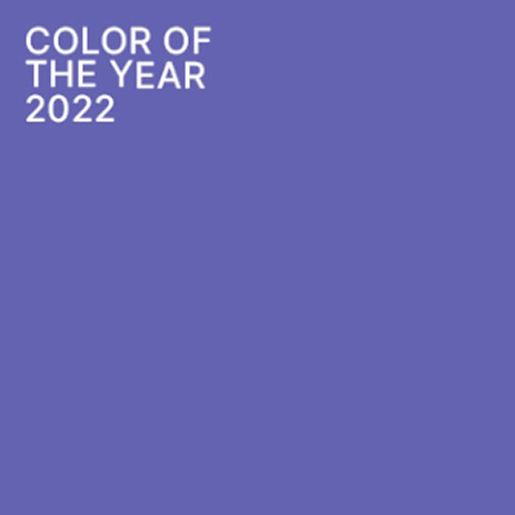
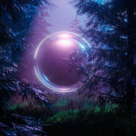
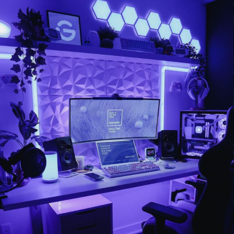
Pantone's Colour of the Year is Very Peri PANTONE 17-3938
There will always be a lot of marketing speak around launches like this, but the imagery surrounding the launch is telling. It speaks of a new era, a fresh start, creativity and possibility. In Pantone's own words: "Displaying a carefree confidence and a daring curiosity that animates our creative spirit, inquisitive and intriguing PANTONE 17-3938 Very Peri helps us to embrace this altered landscape of possibilities, opening us up to a new vision as we rewrite our lives."
In regard to interiors, Very Peri "injects a sense of playful freshness into home interiors, enlivening a space through unusual color combinations"
For ideas on how to apply this colour in your home, The Week have a great article.
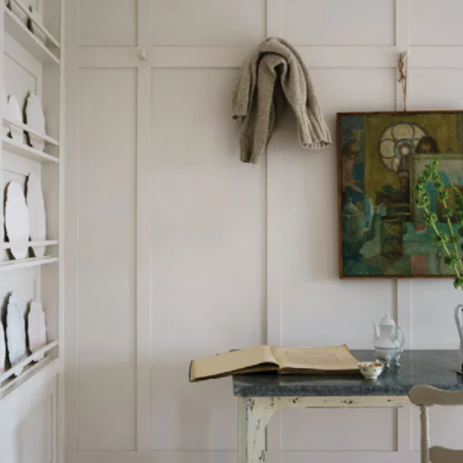
Farrow & Ball
F&B have applied a different vibe to their colour selections for 2022. Whilst Pantone are looking to the future and exploring new possibilities, F&B have embraced a sense of nostalgia, familiarity, and simplicity.

2022 Colour swatches from Farrow & Ball
“There is something inherently human in the colours that we are attracted to for 2022, as well as in the way we use them... Décor is moving forward while drawing inspiration from the modest character of the world of folk and craft, using five significant shades that extol the virtues of a simple life and can be used in any combination and in any room.
School House White is pared back, timeless and familiar without the cool undertones of the more contemporary neutral groups.
Babouche is bold but not garish or overpowering.
Farrow & Ball say “Breakfast Room Green is the most cheerful of all our greens, remaining lively in both bright sunlight or softer candlelight.”
Stone Blue is a warm and timeless blue, not unike Pantone's very Peri
A rich crimson, Incarnadine is “unashamedly classic and glamorous” but versatile when paired with other colours.
Dulux
Again, Dulux has selected a tone that speaks to our optimistic self. We're ready to look forward, to lift our heads. In their words: "Bright Skies promises to open up and revitalise your home. It’s a shade that inspires optimism for brighter futures and helps us reconnect with the natural wonders of the world we live in."
Dulux colour of 2022; Bright Skies
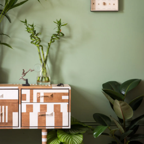
Etsy

Whilst colour forecasting is not Etsy's mainstay, their chosen colour of the year for 2022 is Emerald Green. "Symbolizing harmony and growth, along with royalty and refinement, emerald green is the perfect color to remind us to find balance this year".
We've seen a lot of this green in recent years, particularly in Interiors. Clearly, it's a shade that's here to stay.
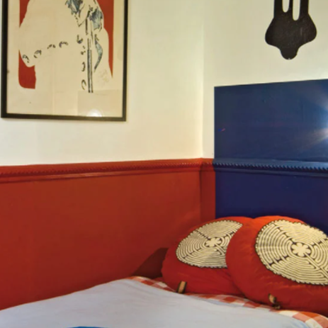
[Knot floor cushion by KNOT STUDIO]
Plenty to choose from in your colour adventures for this year! Here’s one last word of encouragement: Take these forecasts and predictions as a menu to choose from, not a prescription you have to swallow. Trends come and go, but your space is here to stay.